
The One SKU Trap
Most CPG founders think the first SKU is just “get something out that looks good.”
Totally fair. You are trying to launch. You are trying to move fast. You are trying to prove the product.
But here’s the trap.
Your first SKU is not just a design. It’s the blueprint for your next 10.
Because the moment you add a second flavor, a new format, or a limited edition, the questions start piling up:
Where does the flavor go?
What changes and what stays the same?
Do we swap colors? Change photos? Add badges?
Why does the lineup suddenly look messy?
That’s when founders end up paying the hidden tax: mini redesigns, inconsistent packaging, confused shoppers, and a brand system that feels like it is held together with tape.
If you want packaging that scales, you have to treat SKU one like a system from day one.
What “a system” actually means:
A packaging system is just a set of rules.
Rules that make your lineup feel like one brand, while making each SKU instantly clear.
It’s not about making everything look the same.
It’s about deciding what stays locked so you build recognition, and what flexes so shoppers can tell the difference fast.
What should be locked from day one:
These are the things that create brand memory. If these move around every time you add a flavor, the brand starts feeling inconsistent.
Brand block and logo placement
Pick the home. Keep it there across every SKU.
Hierarchy order
Brand, product type, core promise, flavor. That reading order should stay consistent.
Type system
Not just “a font.” The sizes and weights that make your front panel readable.
Layout grid
The invisible structure that keeps everything feeling intentional, not random.
Primary color discipline
You can use different flavors, but you need a consistent base that holds the brand together.
Core claim strategy
Decide what your one main promise is. If every SKU has a different “main thing,” your brand becomes hard to remember.
What can flex without breaking the brand:
These are your SKU signals. They exist to help shoppers pick the right one fast.
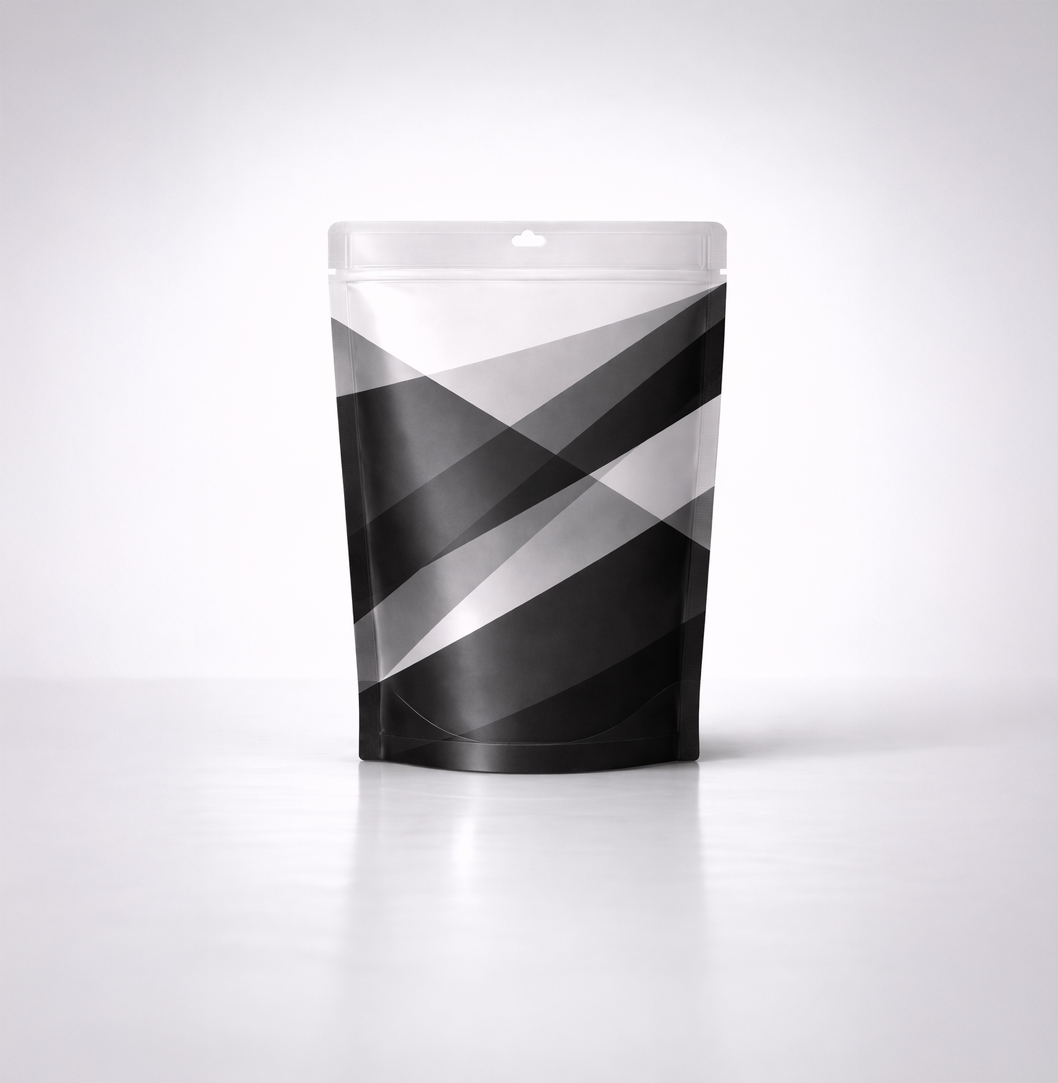
Flavor color
The simplest cue, but it cannot be the only cue.
Variant name
Where it lives and how big it is should be consistent, the word itself changes.
Product imagery
This is where most brands accidentally create confusion by styling everything the same way.
If you have different formats, your photos should look different. Chips should not be styled like sticks. Sticks should not look like straws. Shape matters.
Secondary badges
Keep these controlled. Use them to support the decision, not distract from it.
SKU architecture: design it before you expand:
If you wait until you have 6 flavors to create a system, you will always be cleaning up a mess.
Here’s how to do it early, even with one SKU.
Step 1: Build a “future lineup” on paper:
Write out your next 5 to 10 realistic SKUs. Even if they are not confirmed yet.
Think:
• 3 flavors
• a low sugar version
• a spicy version
• a variety pack
• a limited edition
If your design cannot handle that list, it is not a system yet.
Step 2: Decide your SKU cue stack:
Pick two cues that will always identify the SKU.
Color plus one more cue.
That second cue can be:
• an icon
• a pattern
• a shape label
• a distinct image style
• a flavor band with strong contrast
This is how you prevent wrong grabs when everything lives in the same brand world.
Step 3: Create rules for how claims work across the line:
This is where founders get trapped.
One SKU ends up with 2 badges. Another ends up with 7. Another has a huge callout because sales are soft. Suddenly nothing looks related.
Decide:
• what claim is always present
• what claims are optional
• how many can live on the front before you lose clarity
Step 4: Test it at shelf distance and thumbnail size:
If the SKU name and product type do not read at 6 feet, it will not read in store.
If it does not read at thumbnail size, it will struggle on Amazon.
You do not need a lab for this. Shrink your front panel on your phone. Blur your eyes. Look for what still reads.
The cost of not doing this early:
This is what I see when SKU one is treated like a one-off design.
Every new flavor becomes a mini redesign
You spend more time debating than launching.
Your lineup looks inconsistent
Even if each SKU looks “nice,” the system is not doing its job.
Customers get confused
They grab the wrong one, hesitate, or stop trusting the brand.
Recognition gets weaker
If your layout and hierarchy keep changing, you never build that “I know this brand” moment.
This is why some brands look like they have been around for years with only three SKUs. It is not because they are bigger. It is because they built SKU one like a system.
Quick founder gut check:
If you only have one SKU right now, ask yourself:
Can I add 5 more flavors without changing the layout?
Would a loyal customer grab the right one in 3 seconds?
Do I have two clear SKU cues, not just color?
Is my claim strategy controlled, or will it balloon over time?
If any of these feel shaky, that is not a failure. It just means you are early enough to fix it the easy way.