Cielo
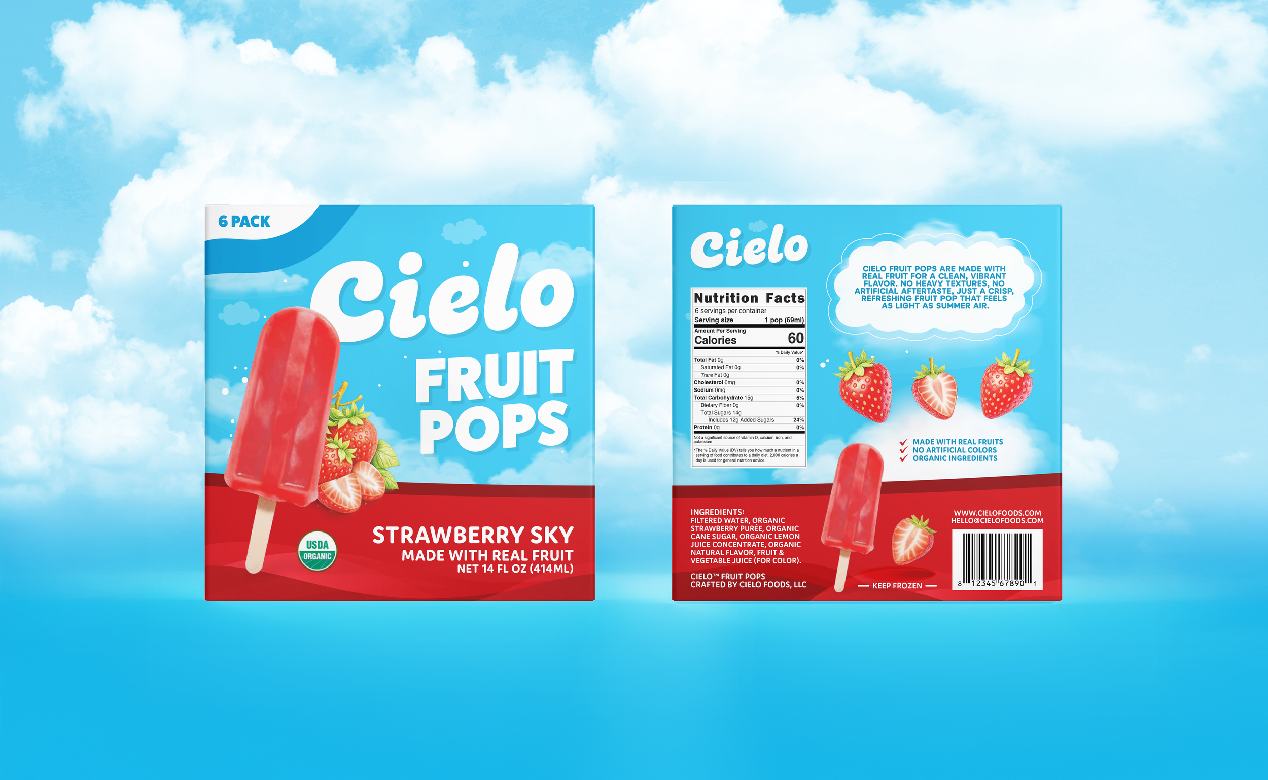
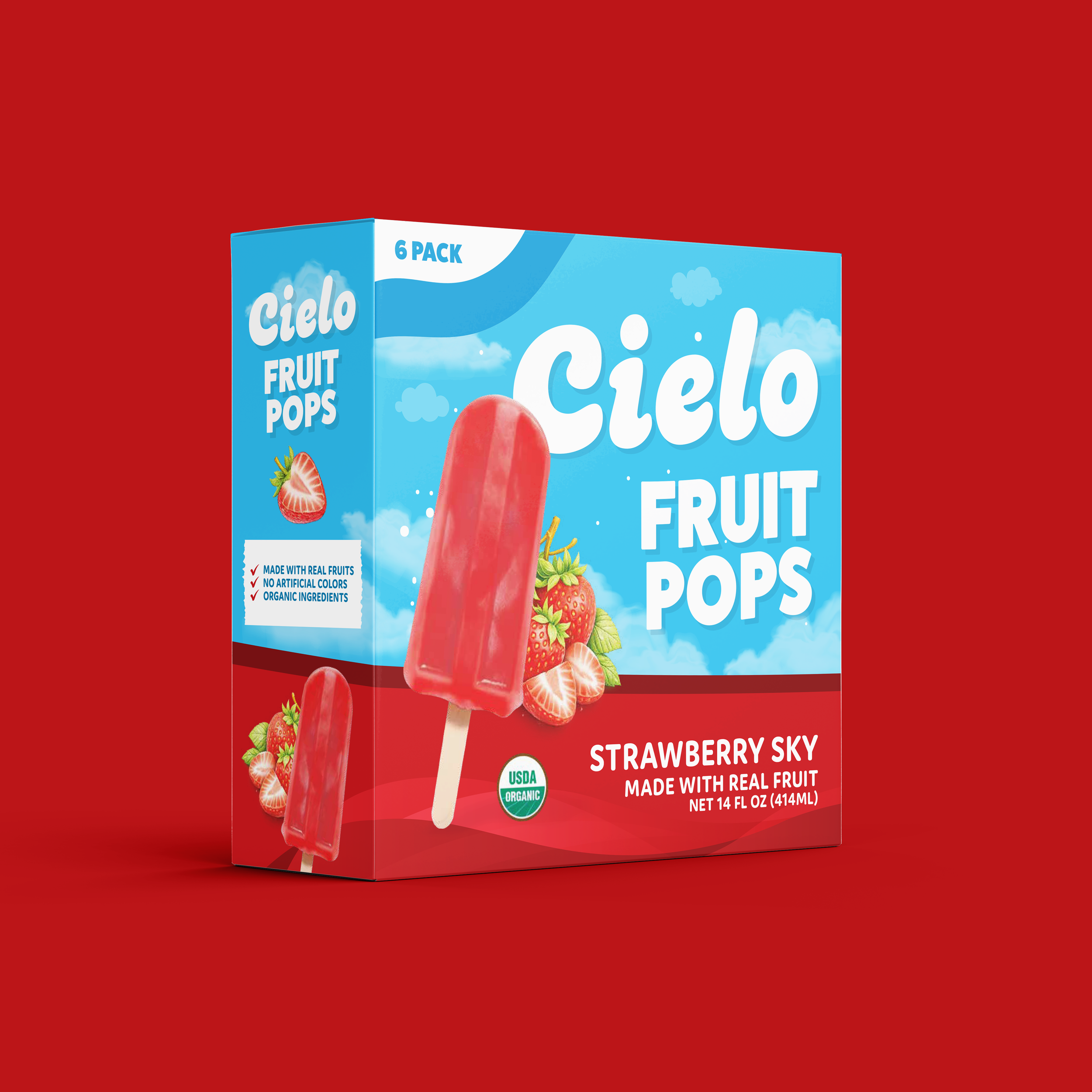
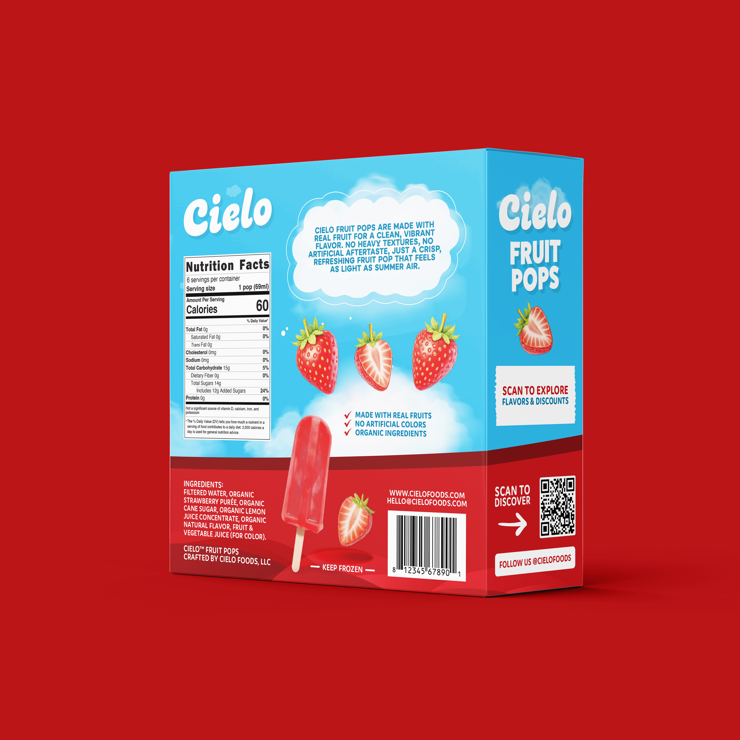
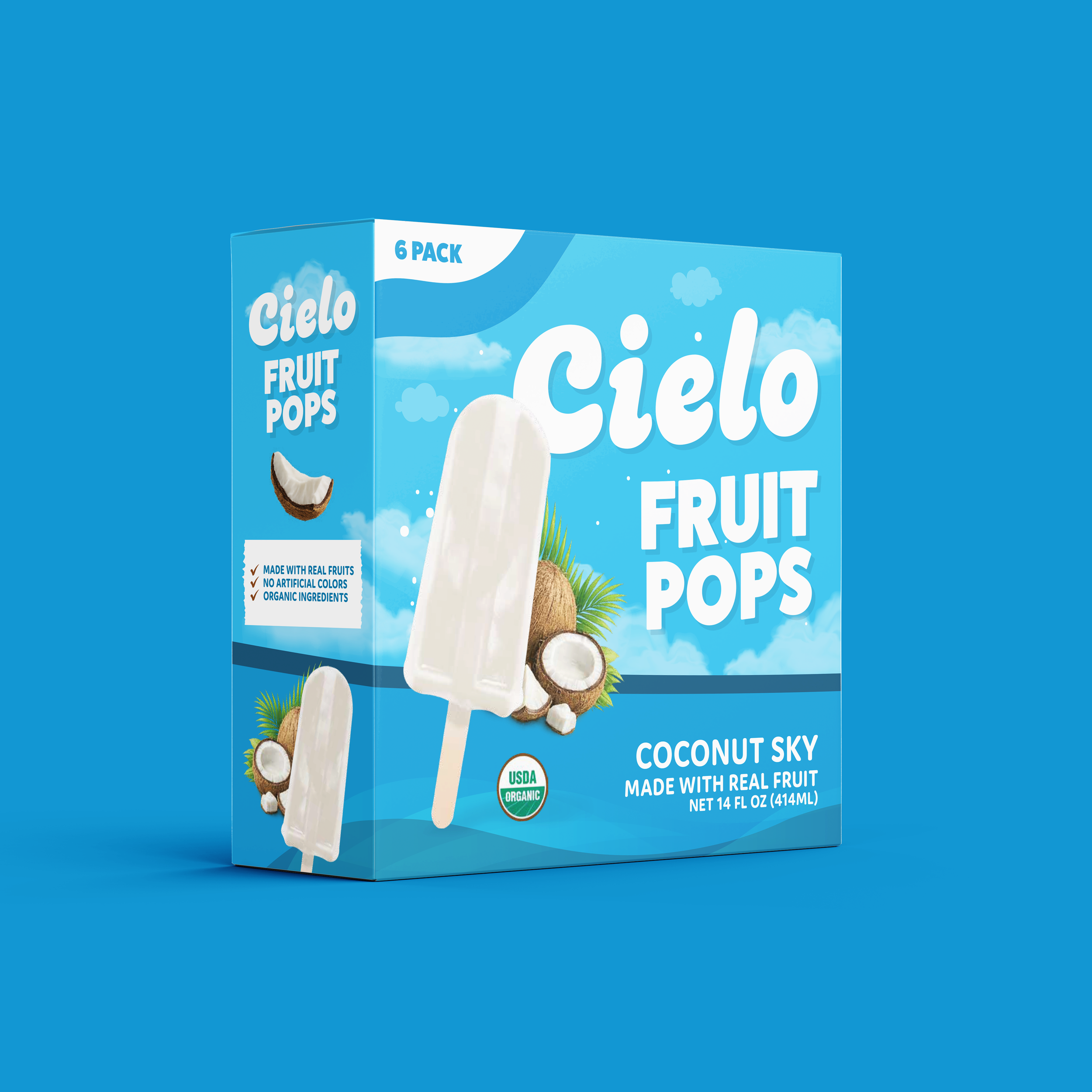
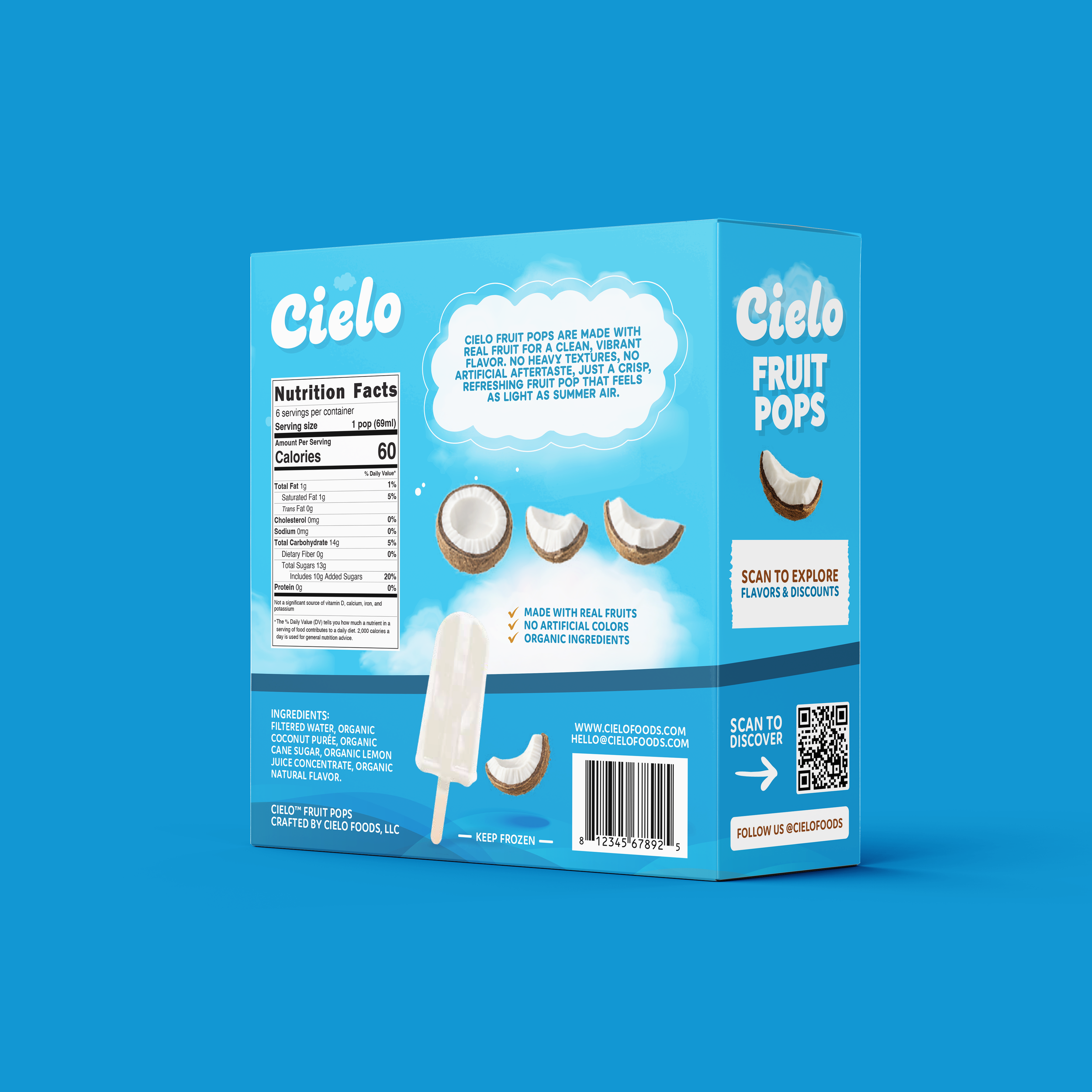
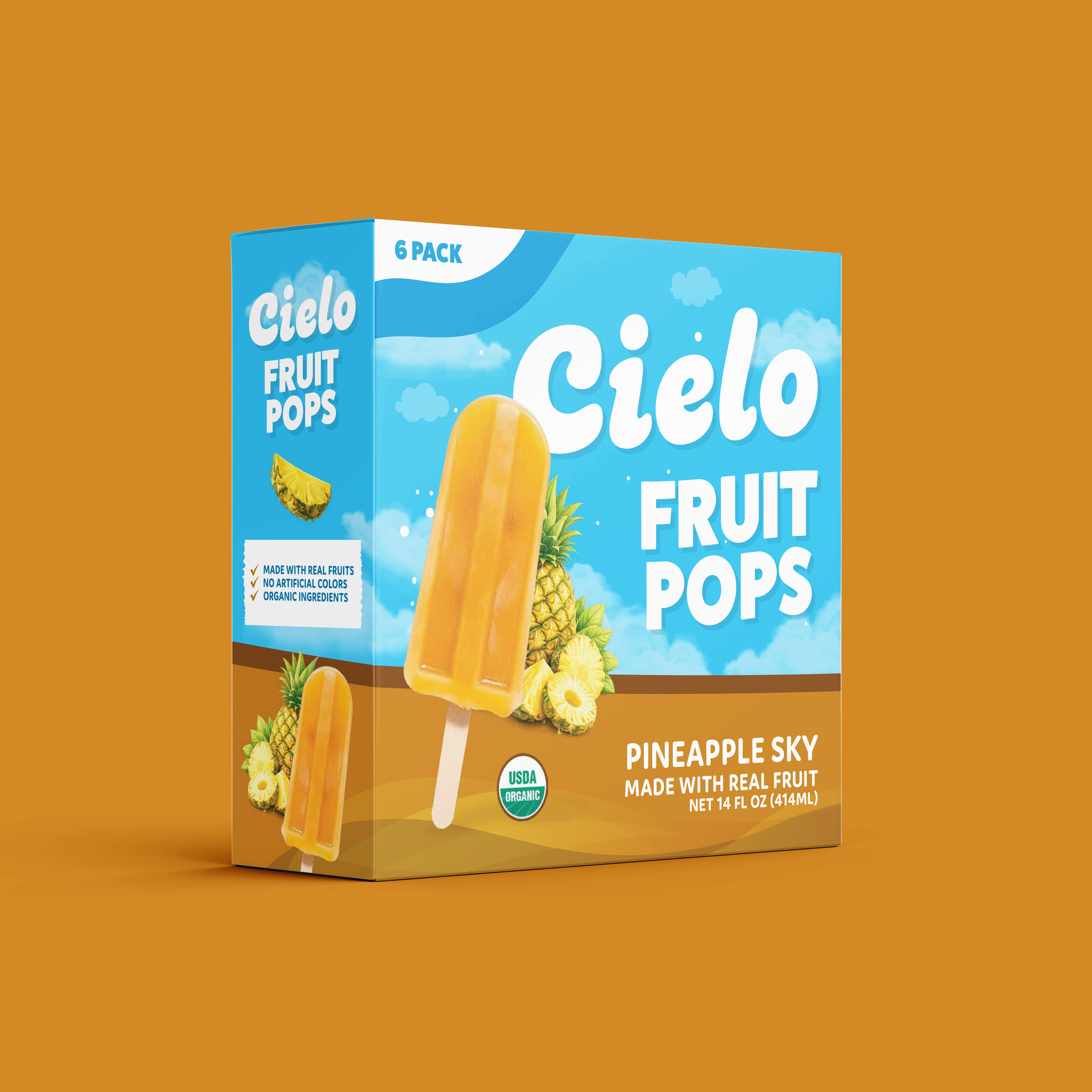
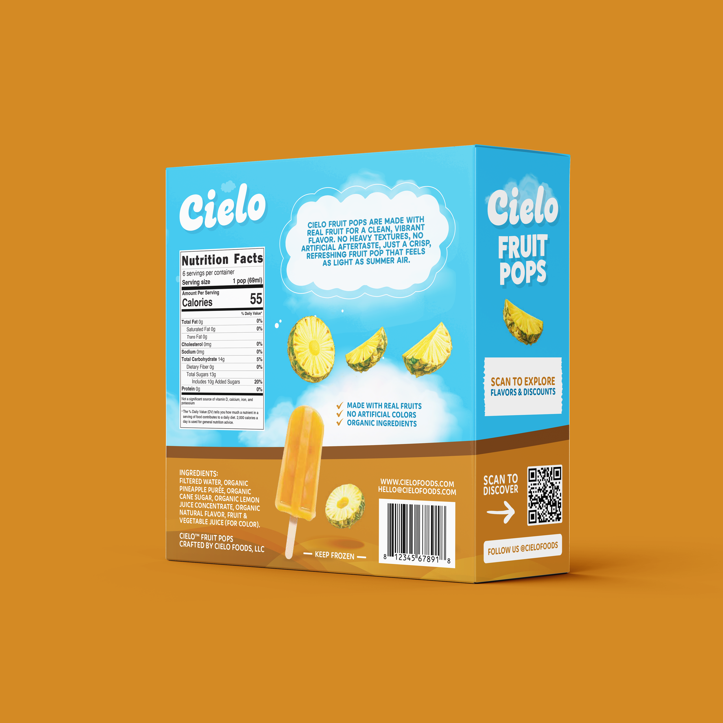
Brand Identity DesignPackaging DesignCIELO Fruit Pops is a passion project built around one central idea: fruit that feels light, clean, and elevated. The goal was to create a brand identity and packaging system that captured the refreshing simplicity of real fruit while still feeling polished enough to stand out across both retail shelves and digital spaces.
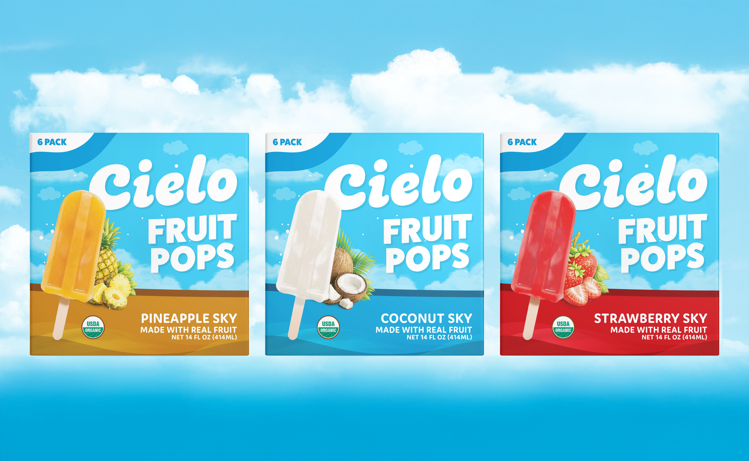
Inspired by soft sky tones, airy visual cues, and fresh-cut fruit, the design balances bold flavor expression with a premium, approachable presence. The system was created with scalability in mind, allowing the brand to grow beyond its initial lineup while still feeling cohesive. With three flavors currently in progress, the packaging was designed as a unified family that can expand over time without losing consistency, recognition, or shelf impact.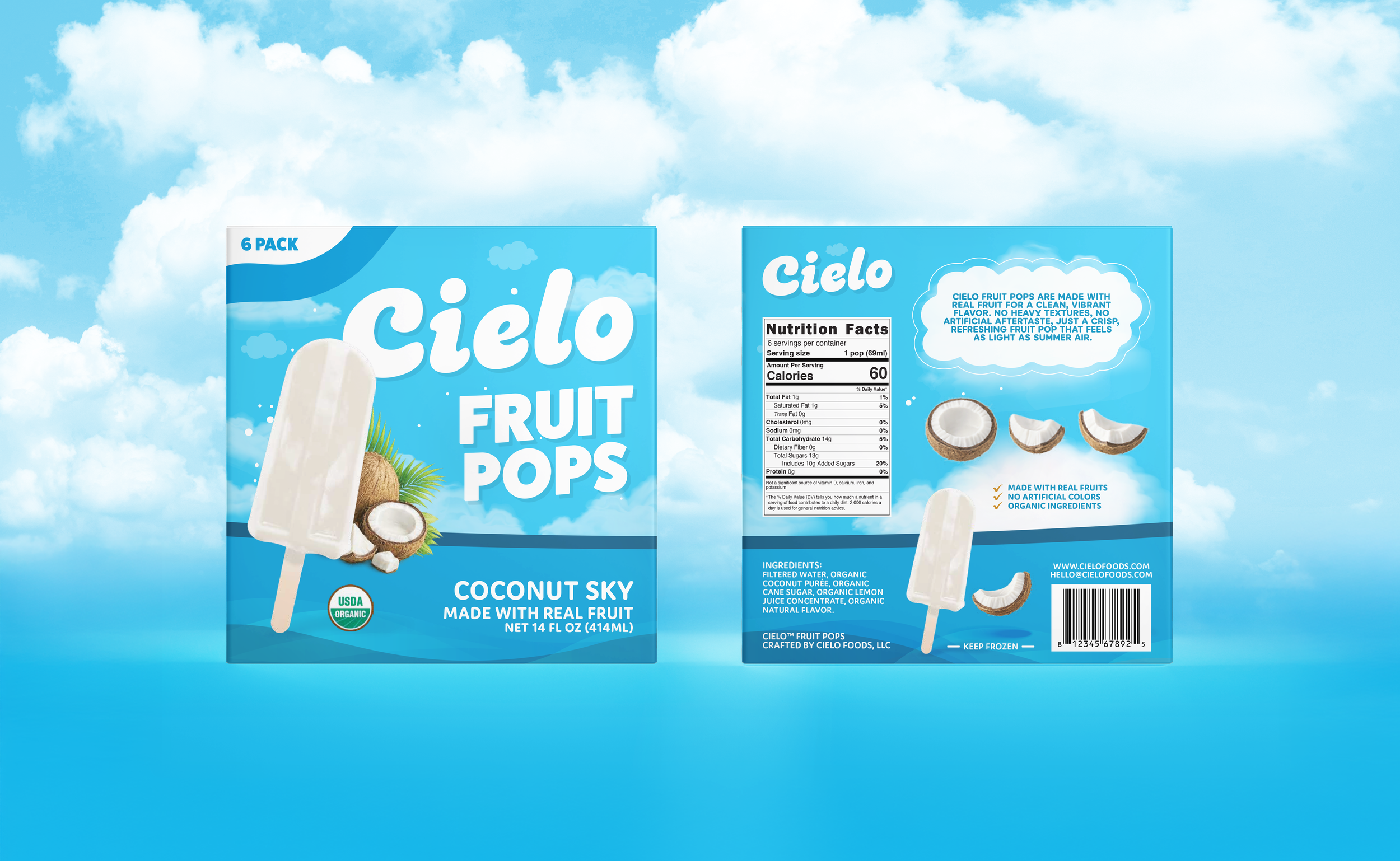
The Challenge
The main challenge was creating a frozen treat brand that felt playful and flavor-forward without falling into a look that felt overly childish, generic, or overly busy. Many products in this category rely heavily on loud visuals or inconsistent flavor systems, which can weaken brand recognition across a lineup.
For CIELO, the challenge was to create a packaging system that could:- communicate freshness and real fruit flavor instantly- feel light, modern, and elevated- maintain strong shelf visibility- scale across multiple SKUs without losing consistency- work effectively both on shelf and on Amazon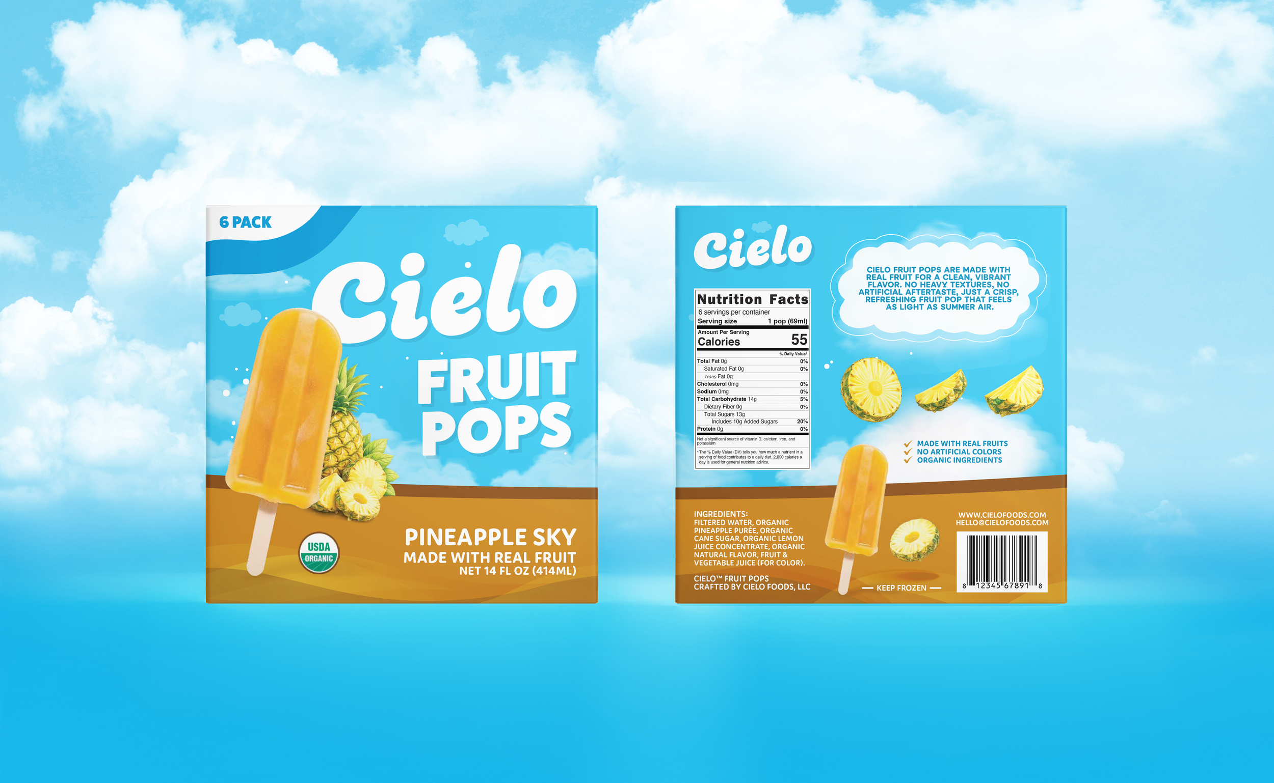
The Outcome
CIELO became an exploration of how to make frozen fruit pops feel more elevated without losing approachability. The final identity and packaging system brings together clarity, flavor energy, and scalability, creating a brand that feels refreshing, modern, and memorable across every touchpoint.